


Table of contents


No headings in the article.
Media Query is a CSS technique used to change the layout of our websites on different screen sizes. For example, the background color of a website is red color on large screen(1200px) and you want to change the color to blue on small screen(600px), so media query comes into handy. We can specify the max-width:600px and set the background color to blue, so as soon as screen size becomes 600 or less background color will change to blue.
@media screen and (max-width:600px) {
  body {
    background-color: blue;
  }
}
Syntax :
@media media-type (media-feature) {
    /* Styling of the elements */
}
You can also omit the media-type so the syntax looks like this:
@media (media-feature) {
    /* Styling of the elements */
}
Let's see what this syntax means. @media - media query definition starts with the @media, without mentioning this you it won't work.
media-type - It refers to the category of media for the device like all, print, screen and speech.
- all - works for all devices.
- print - works for devices where media is in print preview mode.
- screen - works for devices with screens.
- speech - works for devices like screen readers.
media-feature - It includes width and height of the viewport. Basically here we define the sizes of the screen like max-width, min-width and based on this sizes the layout of the web page change.
Max-width
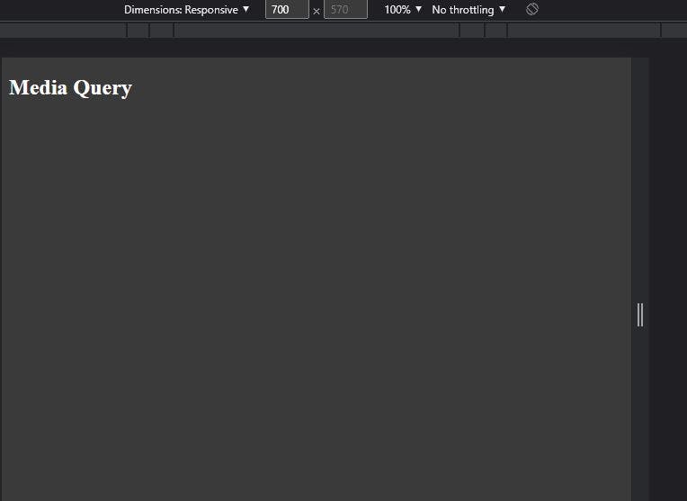
The range starts from 0px till max-width. Let's understand this from example. In the below example, the body is having background color of blackish but as soon as the screen size becomes 700px the background color of the body changes to blue and it will stay blue from 0px to max width of 700px as specified. Once 700px is crossed the background color will change to blackish again.
HTML
<body>
    <h2>Media Query</h2>
</body>
CSS
Before media query
body {
    background-color: #3a3a3a;
    color: #ffffff;
}
Output:
After media query
body {
    background-color: #3a3a3a;
    color: #ffffff;
}

@media (max-width:700px) {
    body {
        background-color: blue;
    }
}
Output:
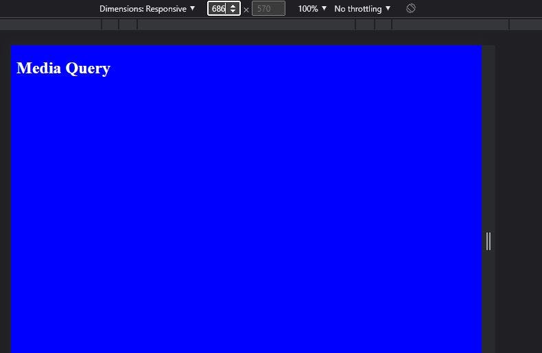
As we can see in the above two images effect takes place when the screen size becomes 700px and below.
Min-width
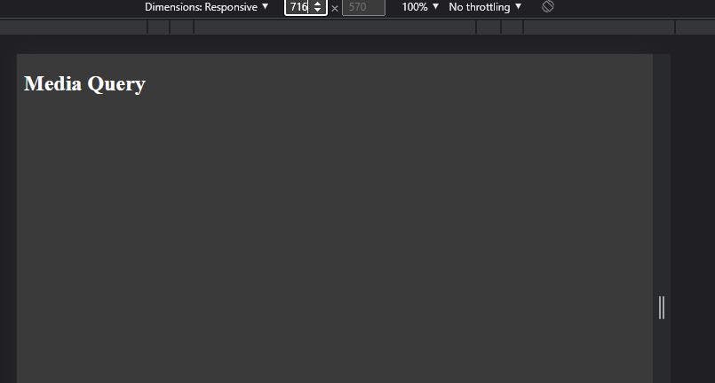
The range starts from min-width and goes till max-width if specified otherwise the max screen size. Let's understand this from example. In the below example, the body is having background color of blackish but as soon as the screen size becomes 400px the background color of the body changes to green and it will stay green from min width 400px to maximum size of screen or if any max width is specified.
HTML
<body>
    <h2>Media Query</h2>
</body>
CSS
Before media query
body {
    background-color: #3a3a3a;
    color: #ffffff;
}
Output:
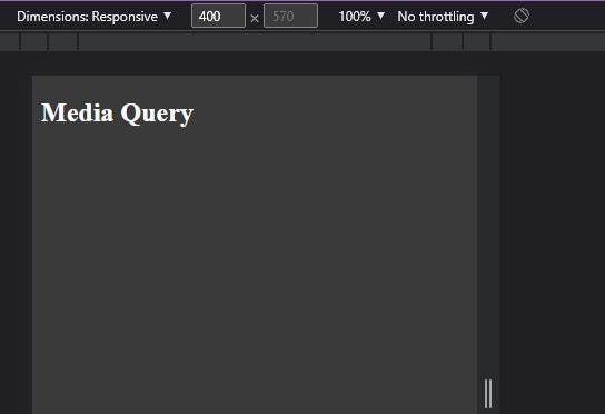
After media query
body {
    background-color: #3a3a3a;
    color: #ffffff;
}

@media (min-width:400px) {
    body {
        background-color: green;
    }
}
Output:
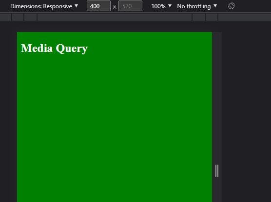
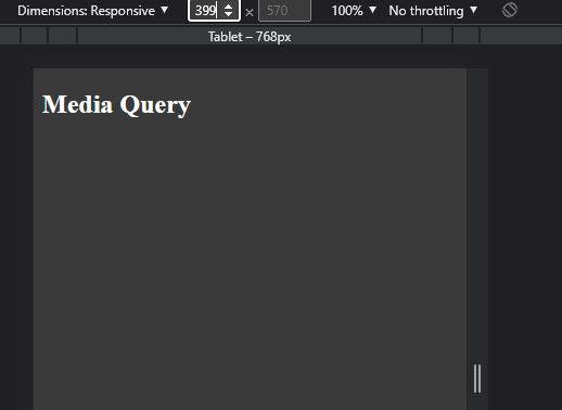
As we can see in the above two images in min-width the effect takes place from min-width and above.