

Table of contents


No headings in the article.
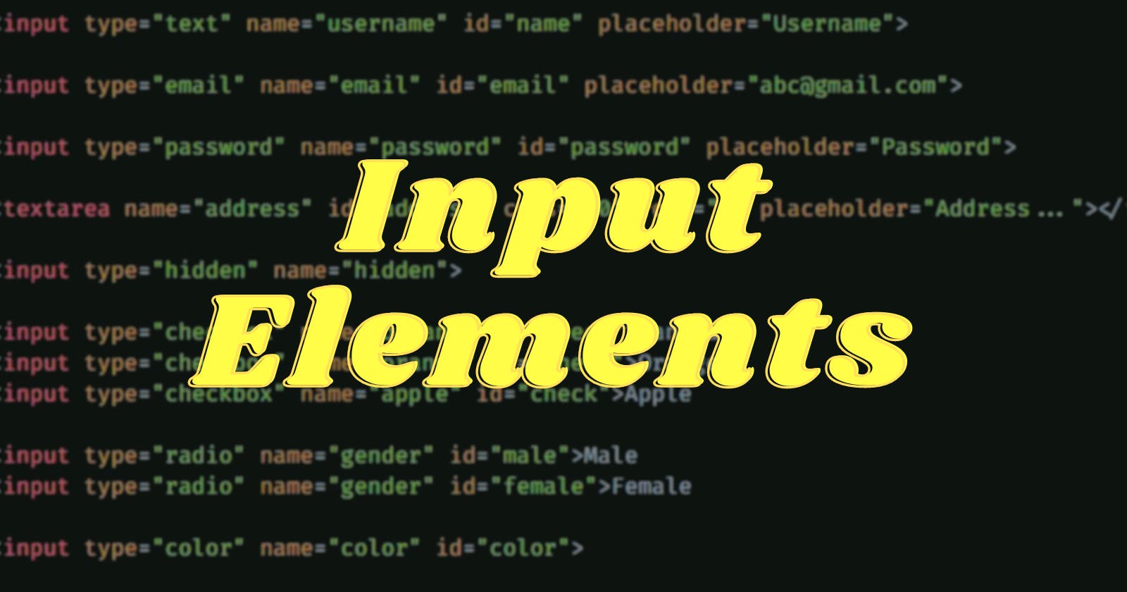
Input Elements are the elements that are used when we want to take input value from the user. These elements are used in the web-based form. There are a whole lot of types of input tags. Input tags are more powerful with the attributes they carry. Let's learn both of them with examples.
Attributes :-
Some common attributes are
name - It tells the name of the input tag and is the most important attribute in form validation.
placeholder - It tells what input value is expected from the user.
id - It is used to uniquely identify/select the input tag.
class - It is used to target a group of input tags.
Input Types :-
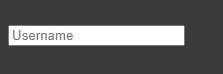
Text : It is the default value. This type is used when you want to enter values like name, username, last name, etc.
Input:
<input type="text" name="username" id="name" placeholder="Username">
Output:
Email : It is used for editing email addresses. It also checks if the entered value is a valid email id or not.
Input:
<input type="email" name="email" id="email" placeholder="abc@gmail.com">
Output:

Password : It is used to enter the password as the name suggests. The speciality of this input element is whatever is being typed in this is hidden and instead, black dots are displayed.
Input:
<input type="password" name="password" id="password" placeholder="Password">
Output:

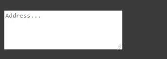
Textarea : It is mostly used when you want to enter long text like an address or message. It contains attributes like cols and rows which are responsible for increasing the size of the text area.
Input:
<input type="password" name="password" id="password" placeholder="Password">
Output:
Hidden : As the name suggests hidden this element is hidden on the browser but the value specified in this is submitted to the server.
Input:
<input type="hidden" name="hidden">
Output:

Checkbox : It is used when we want to select or deselect multiple values or a single value.
Input:
<input type="checkbox" name="banana" id="check">Banana
<input type="checkbox" name="orange" id="check">Orange
<input type="checkbox" name="apple" id="check">Apple
Output:

Radio : It is used when we want to select one value out of many values. To make this happen we should name all the radio buttons with the same value.
Input:
<input type="radio" name="gender" id="male">Male
<input type="radio" name="gender" id="female">Female
Output:

Color : It gives a beautiful color palette option to choose or pick a color. The default is black color.
Input:
<input type="color" name="color" id="color">
Output:

Date : It gives the option to choose the date, month and year. On clicking, it displays a calendar where we can choose the date, month and year. Default is none.
Input:
<input type="date" name="date" id="date">
Output:

File : It is used for uploading files. Files can be anything be it an image, Docx, pdf, etc.
Input:
<input type="file" name="file" id="file">
Output:

Range : It displays a range widget where we can choose the value by sliding it. The default is set to middle. It has attributes like min and max where we can set the minimum and maximum range.
Input:
<input type="range" name="range" id="range" min="1" max="10">
Output:

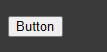
Button : It is a simple push button. It has an attribute value where the value is displayed on the button as the button name. By default, the value is empty.
Input:
<input type="button" value="Button">
Output:
Submit : It is a button that submits the form.
Input:
<input type="submit" value="Submit">
Output:

Reset : It is a button that clears all the form values or resets it.
Input:
<input type="reset" value="Reset">
Output:
