

Table of contents


No headings in the article.
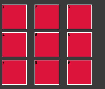
The grid enables you to align the elements in multiple rows and columns. You can make multiple layouts using the grid. Below is an example of three by three column grid layout.
Html:
 <div class="outer-div">
        <div class="inner-div">1</div>
        <div class="inner-div">2</div>
        <div class="inner-div">3</div>
        <div class="inner-div">4</div>
        <div class="inner-div">5</div>
        <div class="inner-div">6</div>
        <div class="inner-div">7</div>
        <div class="inner-div">8</div>
        <div class="inner-div">9</div>
    </div>
Css:
.outer-div {
    display: grid;
    grid-template-columns: repeat(3, 1fr);
    grid-template-rows: repeat(3, 1fr);
}
.inner-div {
    height: 100px;
    width: 100px;
    background-color: crimson;
    border: solid 2px white;
    margin-bottom: 20px;
}
Output:

Properties of Grid:-
display: In this, we tell the browser how we want to display our elements, in this case, it will be a grid. As of now, this will do nothing to change in the browser it just tells the browser to display the grid without this the next properties won't work. The next properties will make the change.
Css:
.outer-div {
    display: grid;
}
grid-template-columns: It allows you to arrange the elements column-wise with a specific margin value specified in it.
Css:
.outer-div {
    display: grid;
    grid-template-columns: 160px 160px 160px;
}
Output:

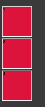
grid-template-rows: It allows you to arrange the elements column-wise with a specific margin value specified in it.
Css:
.outer-div {
    display: grid;
    grid-template-rows: 110px 110px 110px;
}
Output:
gap: This property sets the gap between the rows and columns.
Css:
.outer-div {
    display: grid;
    grid-template-columns: 110px 110px 110px;
    grid-template-rows: 110px 110px 110px;
    gap: 2%;
}
Output:
Before Gap

After Gap