

Flexbox
It is nothing but CSS. Flexbox makes the developer's life easy and saves a lot of valuable time by writing minimal codes to achieve the desired result instead of writing long codes. The basic use of flexbox is to align the elements to center both vertically and horizontally, reverse the elements, order the elements, etc., all this can be done by writing very few codes using flexbox properties otherwise without flexbox to achieve these results would be a nightmare for a developer. Let's jump on to it.
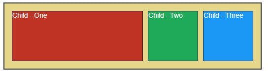
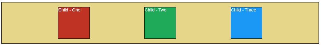
To work with the flexbox you should have a parent element containing a few child elements. Eg:
<div class="parent">
    <div class="child">Child- One</div>
    <div class="child">Child - Two</div>
    <div class="child">Child - Three</div>
</div>
Output:
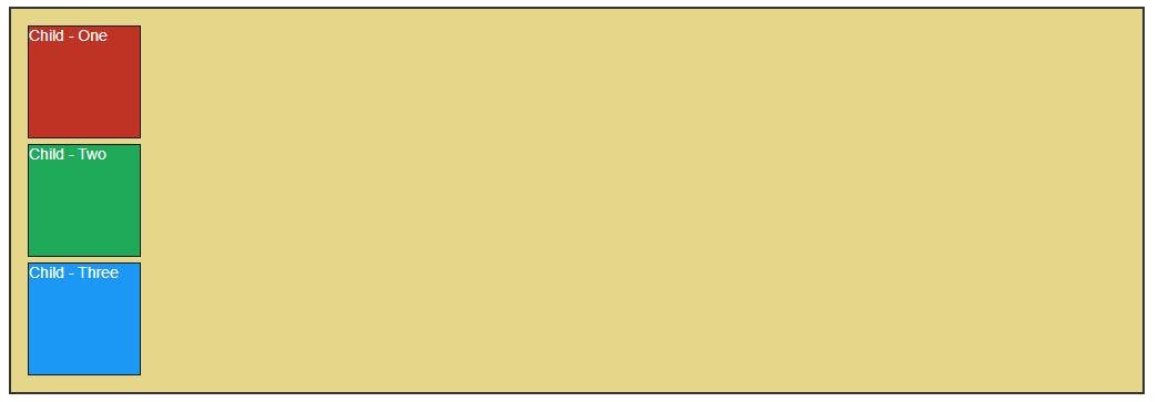
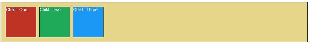
Let's explore some of its properties:
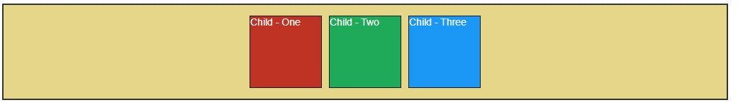
Display Flex Using the display: flex property all the child elements will be aligned side by side.
.parent {
    display: flex
}
Output:
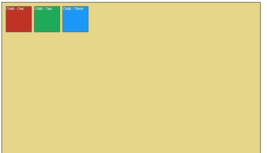
Justify Content It helps to align the elements on the horizontal or main axis.
justify-content: flex-start - This is the default alignment of justify-content that aligns the items to the start of the screen.
.parent {
    display: flex;
    justify-content: flex-start;
}
Output:

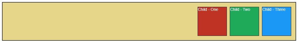
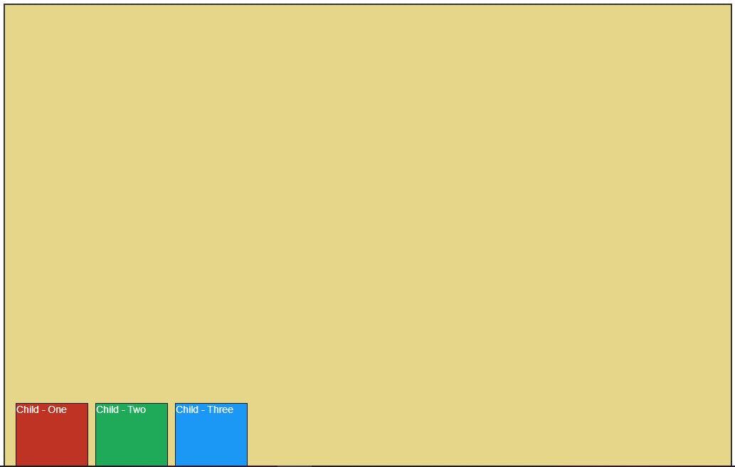
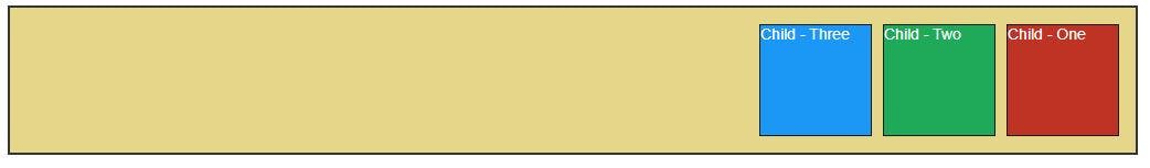
justify-content: flex-end - Aligns the item to the end of the screen.
.parent {
    display: flex;
    justify-content: flex-end;
}
Output:
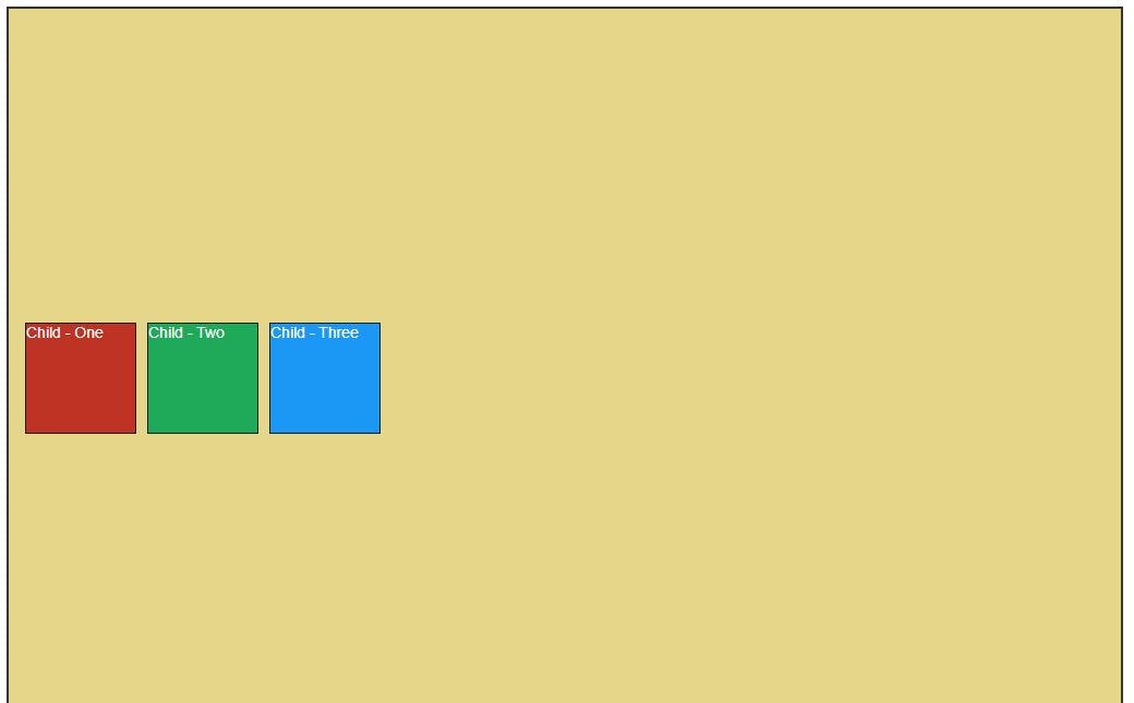
justify-content: center - Aligns the items to the center.
.parent {
    display: flex;
    justify-content: center;
}
Output:
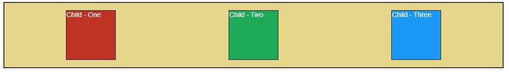
justify-content: space-around - Aligns the items by giving space around each element.
.parent {
    display: flex;
    justify-content: space-around;
}
Output:
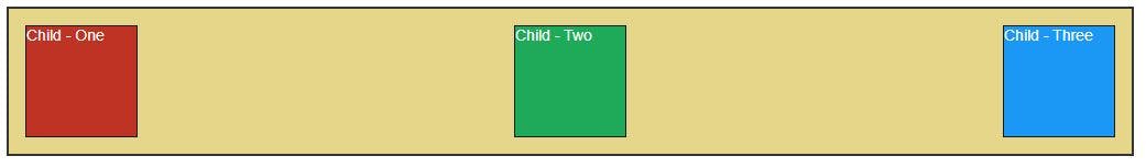
justify-content: space-between - Aligns the items by giving space between each element.
.parent {
    display: flex;
    justify-content: space-between;
}
Output:
justify-content: space-evenly - Aligns the items by distributing evenly space around and between each element.
.parent {
    display: flex;
    justify-content: space-evenly;
}
Output:
Align Items It helps to align the elements on a vertical or cross-axis.
align-items: flex-start - This is the default alignment of align-items that aligns the items to the start or top of the screen.
.parent {
    display: flex;
    align-items: flex-start;
}
Output:
align-items: flex-end - Aligns the item to the end or bottom of the screen.
.parent {
    display: flex;
    align-items: flex-end;
}
Output:
justify-content: center - Aligns the items to the center.
.parent {
    display: flex;
    align-items: center;
}
Output:
Flex Direction It deals with the position of the elements. It contains properties like flex-direction: row, row-reverse, column, and column-reverse.
flex-direction: row - This is the default alignment of flex-direction that aligns the items to the start or top of the screen in the order that is defined.
.parent {
    display: flex;
    flex-direction: row;
}
Output:

flex-direction: row-reverse - Aligns the items to the top right or end of the screen in the reverse order.
.parent {
    display: flex;
    flex-direction: row-reverse;
}
Output:
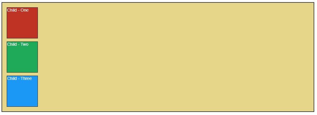
flex-direction: column - Aligns the items vertically on the screen.
.parent {
    display: flex;
    flex-direction: column;
}
Output:
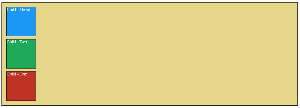
flex-direction: column-reverse- Aligns the items vertically in the opposite order.
.parent {
    display: flex;
    flex-direction: column-reverse;
}
Output:
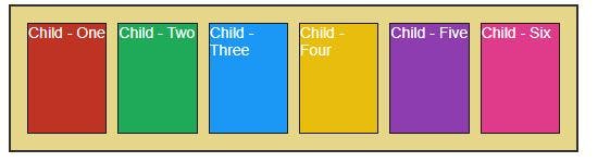
Flex Wrap It is used to wrap or unwrap or reverse-wrap the elements of the parent element. It contains properties like flex-wrap: wrap, nowrap, and reverse-wrap.
flex-wrap: no-wrap - This is the default property value of flex-wrap that keeps the element unwrapped and adjusted in that parent element.
HTML
<div class="parent">
        <div class="child child-one">Child - One</div>
        <div class="child child-two">Child - Two</div>
        <div class="child child-three">Child - Three</div>
        <div class="child child-four">Child - Four</div>
        <div class="child child-five">Child - Five</div>
        <div class="child child-six">Child - Six</div>
    </div>
.parent {
    display: flex;
    flex-wrap: nowrap;
}
Output:
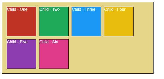
flex-wrap: wrap - It wraps the elements inside the parent element and prevents from adjusting and overflowing the child elements out the parent element boundary.
.parent {
    display: flex;
    flex-wrap: wrap;
}
Output:
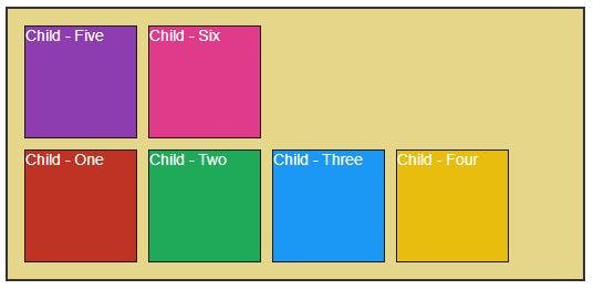
flex-wrap: wrap-reverse -It wraps the elements inside the parent element and prevents from adjusting and overflowing the child elements out the parent element boundary but in the reverse order.
.parent {
    display: flex;
    flex-wrap: wrap-reverse;
}
Output:
Flex Grow It will grow the size of the element.
.parent {
    display: flex;
}

.child-one {
    flex-grow: 2;
}
This will grow the size of the child-one value by 2 and rest elements will get adjusted.
Output: